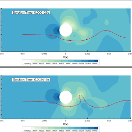
When they’re used well, as this article points out graphs can help us intuitively grasp complex data. It goes on to list – and illustrate – several examples of the counterfactual. The impact can be that much worse, of course, if comparisons between datasets aren’t presented well. See this article for the ways you can avoid such errors using Tecplot.


